AI didn't make creative easy. It moved the hard part.

Everyone has the tools now. That is the problem.
A year ago a polished video ad meant a shoot, a crew and a few grand. Today you type a sentence into a free app and get something back in ninety seconds. The barrier to entry collapsed. So the thing that used to separate good creative from bad, money and access, now separates almost nobody.
The feed fills with AI output that looks like AI output. Slightly plastic. Slightly off. Technically impressive, completely forgettable. You scroll past it because it never gave you a reason to stop.
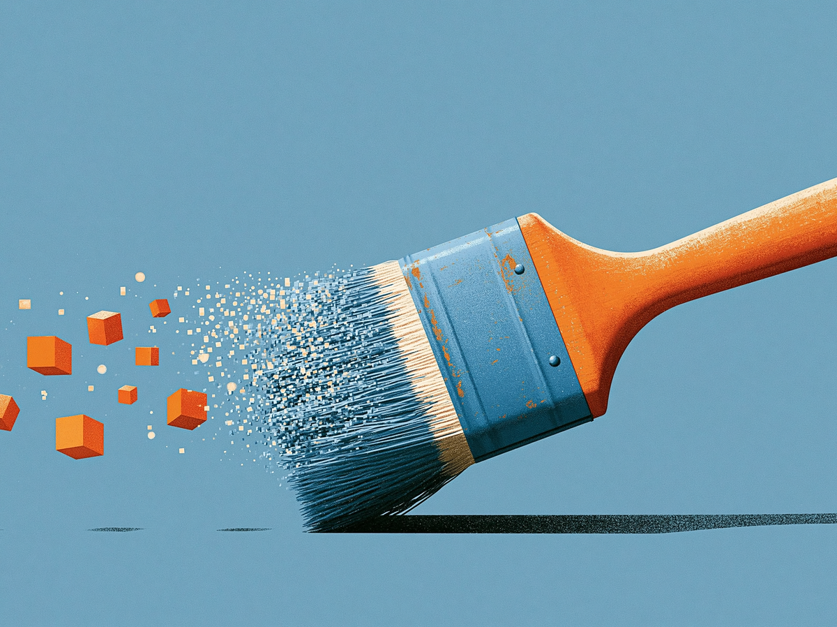
Here is the mistake. People treat the tool as the magic. They grab the shiny toy, type a prompt, and expect the machine to make the decisions a creative director used to make. The tool is not the magic. It is a paintbrush that got cheaper.
The work didn't disappear. It moved.
AI commoditised execution. It did not commoditise judgement.
The technical craft, lighting, retouching, rendering, is now mostly free and instant. What is left is everything before you type: the idea, the angle, the reference, the framing. The decisions. AI made the easy part easy and left the hard part where it was.
That is good news if you do the hard part, brutal if you do not. When everyone can execute, the only edge is deciding better. Good output still needs four things the shiny toy cannot give you:
- Time. Good decisions are not instant.
- Creativity. A familiar idea executed perfectly is still familiar.
- Curiosity. You cannot reference a visual world you have never looked at.
- Rigour. A one off flash of inspiration does not survive a paid media calendar.
You also need volume
Meta and TikTok took targeting off your hands. Your job now is to feed the algorithm a steady stream of creative so it can find your buyers. Diversity and volume are the levers.
So paying four grand for one beautiful video shoot stopped making sense. Not because the video was bad. Because one video cannot feed a machine that wants to test angles, hooks and formats across every persona, every week.
Now you need quality and quantity, and they look like opposites. Quality says slow down and be precious. Volume says ship more, ship faster. Most operators pick a side and lose. The precious ones make two lovely assets a month and starve the algorithm. The volume ones flood the feed with slop and train people to scroll past everything they make.
The framework resolves the tension. Method is the only thing that produces good work at scale, because it turns quality into a repeatable process instead of a lucky accident. Rigour is not the enemy of volume. Rigour is what makes volume safe.
What the creative has to do
Keep one thing front of mind. This is performance creative, running inside a conversion campaign. Attention is not the goal. It is the toll you pay for a shot at the goal, which is a sale.
Every performance ad has three jobs, in order:
- Stop the scroll. The hook.
- Build the desire. The value.
- Drive the conversion. The call to action.
Same logic as the HVC framework. Fail the first and nobody sees the rest. But stopping the scroll was never the finish line.
Lose any job and the asset fails:
- Craft with no hook gets scrolled before it loads.
- A hook with no desire buys half a second and no intent.
- Creative that looks like AI slop erodes trust, and a cold audience needs trust before it buys. Looking professional is not vanity. It is a conversion lever.
The framework: decide first, prompt last
The biggest shift: the prompt is the last step, not the first. By the time you write it, every real decision is made. The prompt just writes them down.
Most people do the opposite. They open the tool and start typing, asking the model to invent the idea, the style and the framing on the fly. It comes out generic because they handed the decisions to a machine that defaults to the average of everything. Average is the one thing creative cannot be.
Run it in this order. Lock each stage before moving on:
- Idea. One sentence. What are you trying to say. This is what the Ad Idea Generator is built to nail.
- Disruption. Pick one device that makes the idea unexpected. Your visual hook. One device, not two.
- Reference. What should it feel like. Name a real visual world: a photographer, a film still, an era. The biggest lever on whether it looks intentional or default.
- Art direction. What should it look like. Subject, setting, props, palette, lighting, styling. The brand lives here.
- Camera. How should it be seen. Lens, angle, distance, depth of field, format. The stage everyone skips.
- Prompt. Write down what you decided. Nothing new gets invented here.
Two notes on doing this well:
- Use an LLM as a research partner, not a decision maker. Before you lock a stage, learn your options. Ask Claude (or your favourite LLM) to list every type of hook, every lighting setup, every lens choice and what each does to a viewer. Decide from the full menu, not the three ideas you walked in with.
- Camera is where curiosity pays off. A wide lens up close warps and energises. A long lens flattens and calms. A low angle makes the subject powerful. Most people never learn this, which is why most AI creative looks the same. The viewer cannot name what is off, but they feel it.
The disruption menu
Quick clarification, because hook is an overloaded word. The message hook (script, text, sound) is covered in the 3 step formula to stop the scroll. This is the visual disruption: the single image choice that stops the thumb. The two work together.
The mechanism: break a pattern. Show the brain something it did not predict and it has to stop to resolve the surprise. Pick one per asset:
- Unexpected scale. Familiar thing, impossibly big or small. A ski jumper off a scoop of ice cream.
- Unexpected context. Object where it does not belong. Penne as the bullet of a lipstick.
- Unexpected behaviour. Subject doing what it should not. A goat sunbaking under a beach umbrella.
- Unexpected material. Right object, wrong substance. A handbag woven from running water.
- Unexpected collision. Two unrelated worlds in one frame. A boardroom on a surf break.
- Unexpected state. Frozen, melting, mid shatter. The moment a thing becomes another thing.
One choice is enough. You do not need six. You need one, landed clearly in the first frame, legible at thumbnail size with the sound off. Then the desire and the call to action do the rest.
Volume without slop
Once the framework is locked, volume gets cheap. You change one variable at a time:
- Same idea, different disruption, and you have three scroll stoppers.
- Same disruption, different reference, and you have a clean test of which visual world your audience responds to.
The decisions you made once become the engine for diversity.
Then you let go. Do not fall in love with one asset and defend it. Produce relevant, on brief creative at volume, feed it to the system, and let the users, the numbers and the algorithm decide. You are not the judge. The data is. Method gives you the confidence to ship, because everything you ship already cleared the bar.
The magic was never the tool
The tools will keep getting better and cheaper. That helps everyone equally, so it is no edge at all. The edge is upstream, in the decisions, in doing the part the machine cannot do for you.
Before you open the app, decide. What are you saying. What makes it unexpected. What should it feel like, look like, be seen like. Get those right and the prompt writes itself.
The tool is commoditised. The decisions are the craft. A repeatable framework is what lets you stop the scroll and earn the conversion, at volume, without drowning your brand in slop. That is the whole game now.